
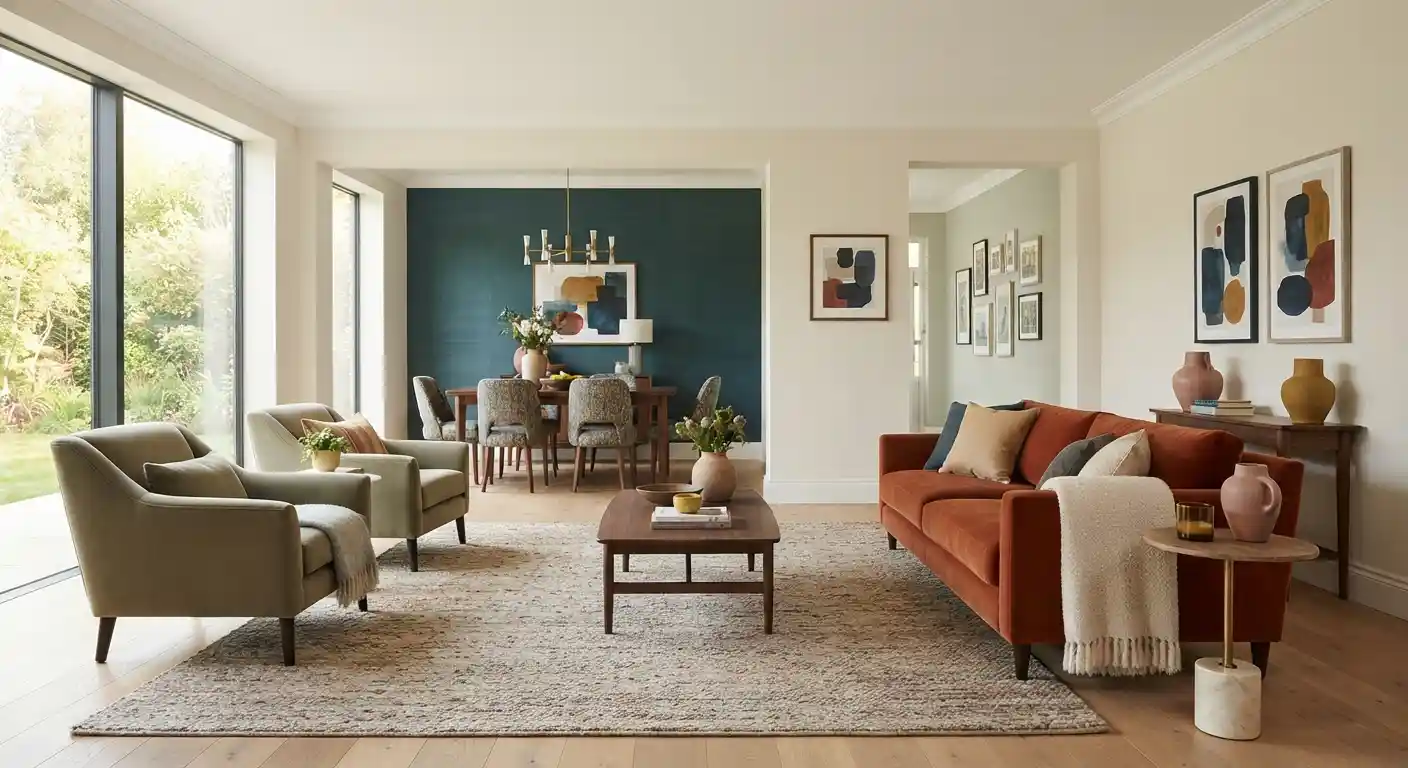
Color plays one of the most important roles in home decoration. The shades chosen for walls, furniture, flooring, curtains, and accessories can influence how large a room feels, how comfortable it appears, and even how people experience the space. A carefully selected color scheme can make an interior feel calm and welcoming, while an unbalanced combination may make the same room appear crowded or disconnected.
Choosing colors does not mean following every interior design trend. The best approach is to understand the character of the room, consider how it will be used, and select shades that complement the furniture and natural light. With a thoughtful color strategy, even simple rooms can achieve a polished and modern appearance.
Understand the Role of Color in a Room
Before selecting specific shades, consider what you want the room to communicate. Bedrooms often benefit from calm and relaxing colors, while living rooms can accommodate warmer or more expressive combinations.
The size of the space also matters. Light colors can make compact rooms feel more open, while darker shades can add depth and character when used carefully. This does not mean small rooms must always be white or pale. Deeper colors can work effectively when balanced with suitable lighting and lighter furniture.
Think about the atmosphere you want to create before purchasing paint, furniture, or decorative accessories.
Start With a Neutral Foundation
Neutral shades provide a flexible foundation for many interior styles. Cream, beige, warm white, taupe, soft gray, and natural wood tones can create a calm background that allows furniture and accessories to stand out.
A neutral palette is particularly useful when you want to introduce different accent colors over time. Instead of redesigning the entire room whenever your preferences change, you can simply update cushions, rugs, artwork, or smaller decorative pieces.
Neutral does not have to mean boring. Combining different shades and textures can create plenty of visual interest without relying on bright colors.
Coordinate Furniture With the Color Scheme
Furniture is often one of the largest visual elements in a room, so its color should be considered alongside the walls and flooring. A sofa, for example, can influence the entire appearance of a living room.
When choosing furniture, consider both its existing surroundings and the colors you may want to introduce later. A versatile furniture color can make it easier to update other parts of the room without creating visual conflicts.
For smaller homes where furniture needs to perform more than one function, a sofa bed with storage can combine practical functionality with a coordinated interior design. Choosing a shade that complements the surrounding palette can help multifunctional furniture blend naturally into the room.
Consider Natural Light
Natural light can significantly change how colors appear throughout the day. A shade that looks warm in the morning may appear different in the evening or under artificial lighting.
Rooms with large windows can often accommodate a wider range of colors because they receive more natural illumination. Darker spaces may benefit from lighter shades that help reflect available light.
Before committing to a particular color, look at samples at different times of the day. This simple step can prevent disappointment after the final paint or furniture choice has been made.
Create Contrast Without Overdoing It
Contrast gives an interior energy and helps important features stand out. However, excessive contrast can make a room feel visually chaotic.
One effective approach is to combine a dominant neutral shade with one or two complementary accent colors. For example, a soft beige background can work with deep green cushions, natural wood furniture, and subtle black details.
Contrast can also come from materials rather than colors. Wood, metal, glass, fabric, and stone can create visual differences while maintaining a controlled palette.
Use Accent Colors Strategically
Accent colors are an easy way to introduce personality without overwhelming the room. They can appear through cushions, artwork, curtains, rugs, lamps, decorative objects, or a single feature wall.
You do not need to use an accent color everywhere. Repeating it in a few carefully chosen places is often enough to create visual connection.
If you choose a bold color, consider balancing it with neutral surroundings. This allows the accent shade to become a feature rather than making the entire room feel busy.
Think About Texture as Well as Color
Two objects can have the same color but look completely different because of their texture. A smooth painted wall, a woven cushion, a velvet chair, and a wooden table can all interact differently with light.
Combining textures is therefore an important part of creating a sophisticated color scheme. Soft fabrics can make a room feel warmer, while polished surfaces can introduce a more contemporary appearance.
This approach is particularly helpful in neutral interiors. When there are fewer strong colors, variations in texture can provide depth and prevent the room from looking flat.
Choose Colors That Support Functionality
Decoration should always consider how a room is used. A busy family living room may benefit from practical, forgiving tones, while a formal sitting room may allow more delicate colors and materials.
Multifunctional furniture also needs to work visually as well as practically. A sofa bed with storage can be useful in a living room, guest room, or compact apartment, but its color and material should still complement the wider interior.
When furniture supports the way a room is used while fitting naturally into the color scheme, the result feels more intentional.
Connect Different Areas of the Home
Open-plan interiors require particular attention to color because several functional areas may share the same visual space. The living room, dining area, and kitchen do not need identical colors, but they should feel connected.
Repeating one or two shades across different areas can create continuity. For example, a neutral living room might share wood tones with the dining area while using the same accent color in cushions and kitchen accessories.
This creates a sense of flow without making every room look exactly the same.
Use the 60-30-10 Approach as Inspiration
A useful starting point for planning a color scheme is to divide the palette into dominant, secondary, and accent shades. The largest portion can come from walls or major surfaces, a secondary shade can appear through furniture and larger decorative elements, and a smaller accent can provide contrast.
This is not a strict rule. Every room has different proportions, lighting, and furniture requirements. Instead, use the concept as a way to avoid giving too many colors equal visual importance.
A clear hierarchy usually makes an interior feel more balanced.
Be Careful With Trends
Interior color trends can be useful sources of inspiration, but they change regularly. Choosing an entire room based on a short-lived trend can make the space feel dated when preferences change.
Instead, consider using trendy colors through easily replaceable items such as cushions, artwork, throws, lamps, or smaller accessories. Keep larger investments such as sofas, beds, and storage furniture in colors you are likely to enjoy for longer.
This creates a timeless foundation while still allowing the interior to feel current.
Make Small Rooms Feel More Spacious
Color can influence the perceived size of a room. Lighter shades often reflect more light and can make walls feel less imposing. Keeping the ceiling lighter than the walls can also create a sense of height.
However, color is only one part of the equation. Furniture scale, lighting, storage, and clutter also influence how spacious a room feels.
Multifunctional furniture can help because it reduces the need for separate pieces. When combined with a light and cohesive color palette, this can make compact interiors feel considerably more comfortable.
Add Personality Through Accessories
Once the main color scheme is established, accessories can introduce personality. Artwork, cushions, rugs, plants, books, and decorative objects provide opportunities to experiment.
Accessories are also easier to change than major furniture pieces. If your preferences evolve, replacing a few decorative elements can give the room an entirely different mood without requiring a complete redesign.
The most successful accessories usually have some connection to the existing palette. Repeating colors or materials creates a cohesive appearance.
Keep Your Personal Style in Focus
Interior design should ultimately reflect the people who live in the home. While design advice can provide useful direction, there is no single color combination that works for everyone.
Some people prefer warm neutrals and natural materials, while others enjoy dramatic dark tones or brighter accents. The important thing is to create an environment that feels comfortable and reflects your lifestyle.
Choose colors that you genuinely enjoy rather than selecting them simply because they are popular.
Final Thoughts
Choosing the right colors can transform the character of a home without requiring complicated decoration. A balanced palette, suitable furniture, natural lighting, contrasting textures, and carefully selected accents can work together to create an interior that feels comfortable and visually appealing.
The best color schemes are also practical. They support how each room is used and allow furniture and decorative elements to work together naturally. By starting with a strong foundation and introducing personality through carefully chosen details, you can create a home that feels stylish today while remaining adaptable in the future.